About Maria Kirk Mikkelsen
I am a Danish designer, researcher and educator. I am passionate about design and especially about how we design. My expertise lies in the intersection between Colour and Material Design, Design Methodology, Aesthetic Practise and Education. I am currently studying a PhD at Kolding School of Design where I previously have worked as Senior Lecturer teaching Colour and Material Design as well as conducting artistic research.
Read more about Maria Kirk Mikkelsen or follow me on instagram
::

PhD project: Exploring an Experimental and Material-based Colour Design Practice
With this project, I will investigate how elements from classical colour theory and aesthetic theory of atmosphere can form both the basis for the development of an experimental and material-based colour design practise and the basis of a contemporary colour terminology using harmony and atmospheres as perspectives to analyse and discuss the designed colour combinations. The PhD project is funded by Independant Research Fund Denmark.
Read about more the PhD project
::

Tell it all with Leather and Stripes:
Artistic research on material aesthetics
‘Tell it all with leather and stripes’ is a discription of the project ‘Narrating Material Aesthetics’, which contributes to the study of the designer’s narrative authority, partly through an analysis of students’ work and partly through a design experiment. The project has been carried out as artistic research, which means it has been completed by a designer whose use of design methods and reflective practice generates new knowledge about design. The project lies in the intersection of a number of design research fields: storytelling, material, aesthetics and design processes’. Read the paper: ‘Tell it all with leather and stripes’
::

My Quest for Beauty:
An essay about the love we can feel for a design
The text sets out to explore and attempt to pin down the notion of beauty as by drawing parallels between beauty, aesthetics and four designerly viewpoints; Harmony, Trend, Sensation and Experience. In a time with an abundance of immaterial and intellectual concept designers, meeting designers, system designers and so on, I call on the old-fashioned designer’s basic skills to give form and create beauty. The essay is written as part of the artistic research project ‘Narrating Material Aesthetics’.
Read the essay: ‘My Quest for Beauty’
::

Colour Matters:
Artistic research in the intersection between colour theory and CMF design
The artistic research project ‘Colour Theory meets CMF’ explores how classical colour theory can be expanded to take into account the three aspects; material, shape and light. The aim of the project is to create a didactic tool that can be used in colour education for design students, as well as by students in individual projects. The process and findings are discribed in the book ‘Colour Matters’
::

On Colour Mixing – without mixing Colours:
An essay about colour and yarn
Textile designer Astrid Skibsted has transformed yarn windings into a fine art and communication form unto itself. She has worked with yarn windings for a decade and has recently published the book ‘The Yarn Winding Manifesto’ in which she exhibits her work. For the book I have written an essay about the Bezold-effect and how the weaver creates colour sensations by mixing yarns. You can see Astrid’s work and buy her book on astridskibsted.dk. Read the essay ‘On Colour mixing – without mixing colours’
::

Composing Colour Harmonies:
An artistic research project at Kolding School of Design
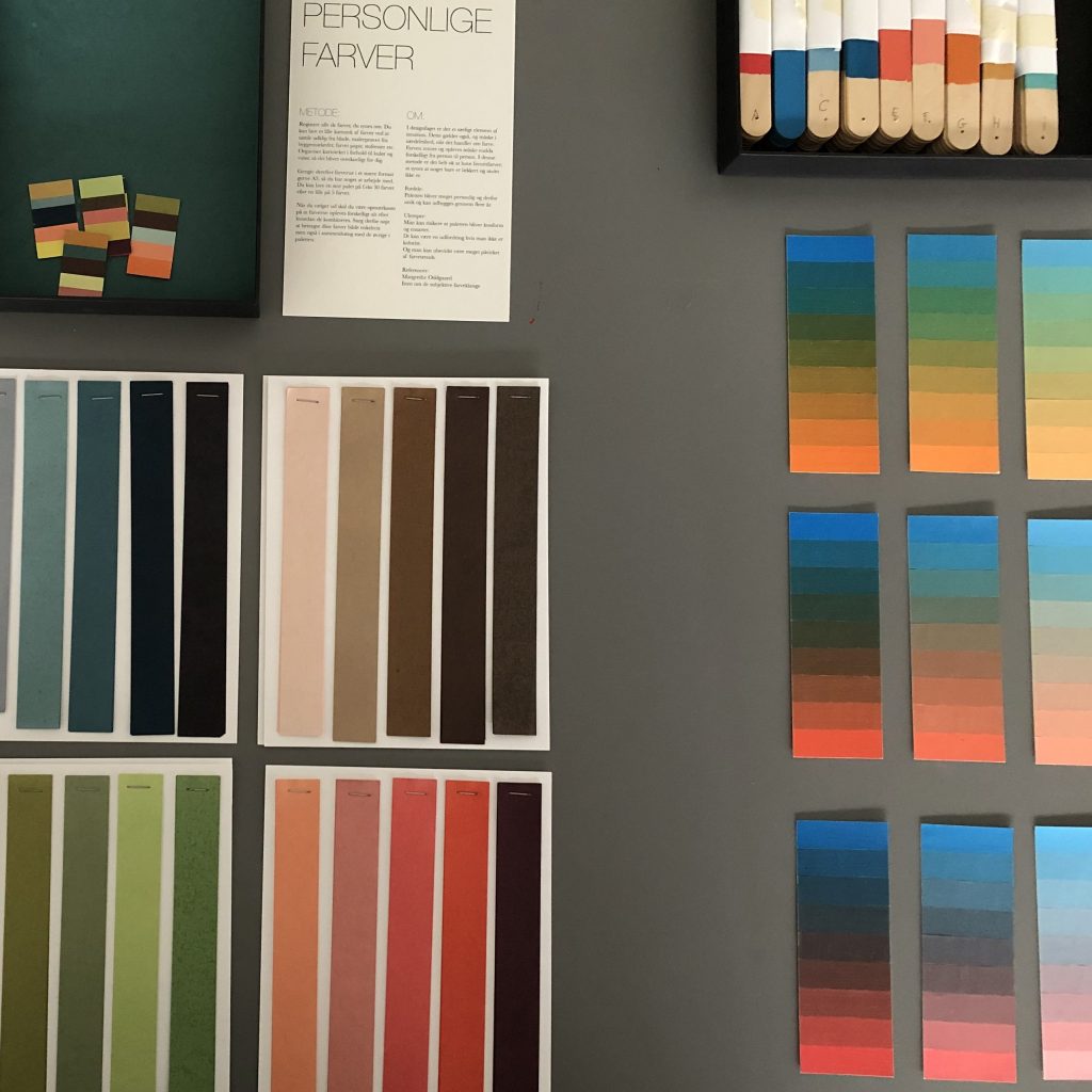
The artistic research project ‘Composing Colour Harmonies’ explores colour harmonies and how they can be created in design processes. Definitions on harmonies from colour theory and procedures from practising designers are tested and formulated as methods. The project is described in the danish report ‘Palet’. If you are not danish speaking you can find some information about the project in the papers: ‘A Colour Palette Methodology’ and ‘Colour Combos. Methods in design education’.
::

Hacking Colour History:
Colour designs for meeting rooms at Kolding School of Design 2017
A colour program for meeting rooms at Kolding Design School building on masters of colour design. The function of the rooms is expanded from being solely meeting rooms to also being an archive of colour. A library of design. But composed in a different way than first intended. Each room is coloured according to Le Corbusier’s Claviers de Coleurs from 1931 complemted by curtains designed and colored by Patricia Urquiola. This information is provided in each room with white foil, like the info text in a museum or an index card in an archive.
::

Fugldal:
Visual identity and colour program for daycare center
Remodeling and furnishing of a 100 square meter unheated room with different functions as well as colour program and visual identity for the institution. Carried out in collaboration with parents of children in the institution. 2016. Role: project leader and graphic/ spatial/ colour designer.
::

Rhythmic Arrangement of Filters:
An exploration of colour and composition
‘The rythmic arrangement of filters’ are in a constant flow of transformation. Over time I have added more patterns and more colours. The filters consist of a series of patterned acrylic sheets and coloured boards. Read more about the project ‘Rhythmic Arrangement of filters’
::

We salute the Sketch:
A tribute to weaving and intuitive design processes
‘We salute the sketch’ is a joint project between Helle Gråbæk and Maria Kirk Mikkelsen, both textile designers and both senior lecturers at Kolding School of Design. In 2014 they met up for two days in Maria’s studio and did nothing but play. Read more about the project ‘We salute the Sketch’
::

Fredericia Sundhedshus:
Wayfinding strategy and colour program for a converted hospital
Transformation of an old hospital into a modern health care center. In collaboration with Fredericia Municipality and junior designers fra Design School Kolding. 2018
Role: project leader and designer
::