
Colour Matters
by Maria Kirk Mikkelsen
Published by Design School Kolding 2019
ISBN: 978-87-93416-39-0 (print)
ISBN: 978-87-93416-40-6 (digital)
All you see is colour.
You might think you see form, but the only reason you think it is form is because the colours tell you. You can feel a form with your hands, but you can only see colours. The colour boundaries inform you about shapes, the colour gradients inform you about spatiality and the saturations of the colours inform you about distance. When you first realize that everything you perceive with your eyes is colour, you also understand the significance of how you work with colours.
When designers and architects use colour, they do so in a combination of materials, of three-dimensional form and often in different exposures. Colour changes its character according to its surroundings; it interacts with adjacent colours, but also with the form on which the colour appears, with its material and with the light illuminating the colour. Thus, there is a difference between the actual colour and the perceived colour.
When light hits the same colour on a matte and on a glossy surface the light will be reflected differently and affect the perceived colour. When light hits a curved shape, a number of colour gradients will emerge between light and dark, affecting the perceived colour. For professional designers this can be tacit knowledge they have gained through many years of experience, or it can be knowledge that is not known. For design students it is something that has to be experienced and understood.
This small textbook is meant for students, designers and architects who seek knowledge about the relationship between colour and material and who are looking for inspiration to work within the field. Through examples and exercises, this booklet describes how material affects the perceived colour.
Colour Material Design
Physical design products have always included both materials and colours. The designer has worked intuitively or methodically to match colours and materials to the shape and functionality of the product. Today, designing colour and material strategies is an independent design discipline, also known as CMF (Colour Material Finishing) or CMD (Colour Material Design). The field has grown rapidly in the design industry during the last two decades. The CMF designer develops colour and material strategies for a product and relates them to the attributes of both materials including performance, production and life cycle as well as to the product’s emotional value. The design work lies in translating a brand’s values into the sensory aspects of a product, which places CMF design in a key position in the company’s decision-making processes. The companies are aware that colour and material choices are decisive factors in the success of a product in terms of sales and viability and that CMF can create a strong emotional connection with their consumers. CMF designers are represented in many big companies with an industrial design department, such as in consumer goods, electronics, fashion, transportation and others.
Itten’s seven colour contrasts
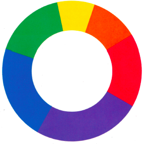
Johannes Itten’s theory of colour, which was developed at the Bauhaus School in the 1930s, is still widely used today when teaching colour theory in design and architecture education. The colour theory is simple and logically explains the coherence of the colours. The development of the colour classes at the Bauhaus School was mainly driven by Johannes Itten, Joseph Albers, Wassily Kandinsky and Paul Klee. They were all visual artists who studied and disseminated their insights using painting as their medium. The three aspects; material, shape and light and their effect on colour perception was not described in Johannes Itten’s theory of colour.
Today we know that colour theory is far more complex than it appears in Itten’s theory. We no longer consider red, yellow and blue as primary colours but talk about complex connections between additive and subtractive colour, between light and material, between CMYK and RGB. This does not mean that we should discard Itten and his theory of colour, but rather consider his work in the historical context in which it belongs. In his theory Itten establishes seven contrasts between colours. These different contrasts are still relevant and give rise to talk of the reciprocal relationship between colours.
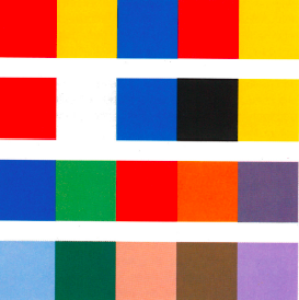
Contrast of Hue
This contrast indicates different hues of the colours. The primary colours have the highest contrast of hue, whereas secondary and tertiary colours have lower contrasts of hue.

Contrast of Value
This contrast describes a light and dark contrast between two colours. The highest contrast of value is found between black and white.
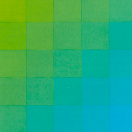
Contrast of Cold and Warm
The colours in this contrast relate to other memorised sensations. The highest cold-warm contrast is between blue-green that resembles ice and red-orange that resembles fire.

The Complementary Contrast
This contrast occurs when two colours are diametrically opposite each other in the colour wheel. When a pair of complementary colours are mixed the result is grey.

The Simultaneous Contrast
This contrast is a result of our vision trying to create a strong contrast. The simultaneous effect occurs when two colours affect each other and induce a visual contradiction with each other.
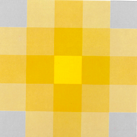
The Contrast of Saturation
This contrast, also called Contrast of Quality, relates to the degree of purity of a colour. This contrast is found between pure, intense colours and dull, desaturated colours.
Contrast of Extension
This contrast represents the size ratio between two or more colour patches. Itten suggests harmonious proportions based on Goethe’s work on lightness.
Creating
In line with the work of the CMF designer, the product designer develops a colour and material strategy for each product or collection she designs. This strategy supports the narrative of the product together with form and function. Designers who work with physical products, whether it is fashion, books or furniture, take into account how the material affects the colour experience. The material is chosen not only for its performative attributes but also for its aesthetic qualities.
A method for experimenting with colour and material compositions and analysing these is introduced in the following chapters. The method can be used to investigate the material’s aesthetic qualities when it is experienced together with the colour. Itten’s Seven Contrasts is applied as a framework for the studies, but the method can be adjusted to other approaches.
First, the analysis tool ‘The Colour and Matter Links’ is introduced. It can be used to understand and communicate the relationship between a material and its colour. To some extent, it can also be used to analyse compositions of colour and materials in a design product, as it can highlight colour differences that arise in the materiality.
Next, two types of experimental approaches are introduced which can be used in the work of colours and materials. The two types of experiments are called ‘The Systematic Experiment’ and ‘The Exploratory Experiment’. There are advantages and disadvantages of both types, and variations between the two types of experiments occur as well.
Third, a series of experiments made of different materials are reviewed, each showing one of Itten’s seven contrasts. Through these seven examples, the relationship between colour and material is discussed, but also the nature of the experiment and the possibility of evaluating it. With these few guidelines, the designer can begin to collect a colour and material library and examine how colour and material interact in her own field of design.

The colour and matter links
Since we are dealing with colours embedded in a material, a ‘Colour Sample’ is here defined as a physical object that has both a colour and a matter. This makes the appearance of the colour dependent on the material properties. In order to clarify the mutual impact of the material and the colour on each other, ‘The Colour and Matter Links’ tool can be used to analyse the relationship between colour and material. It introduces four different types of relations called links. Each of the links indicates a specific relationship between the colour and that part of the material property that is relevant for the visual perception of the colour. This leaves out certain tactile properties such as flexibility or softness as well as performative properties in the material. Each ‘Colour and Matter Link’ is presented as a continuum with two extremities in between which a specific colour sample can be placed.
The four ‘Colour and Matter Links’ are:
Transparency: from opaque to transparent
Texture: from flat to relief
Finish: from matte to glossy
Uniformity: from monochrome to grained
The first ‘Colour Matter Link’; ‘Transparency’ indicates the transparency of the material and thus the colour. With transparent materials, the colour and the light of the background also begin to influence the overall perception of the colour sample. ‘Texture’ defines the surface of the colour sample from smooth via a light structure to a rough relief. Here, the ultimate extremity would be a total, spatial form. ‘Finish’ is also about the surface of the material, but where ‘texture’ indicates a three-dimensional structure ‘finish’ is the ‘skin’ of the surface varying from matte to glossy. ‘Uniformity’ indicates the uniformity of the colour in the material from monochrome to grainy. There is a difference in the colour’s appearance in a material that is dyed throughout compared to materials with irregularities in colours such as natural stone or a woven fabric with different coloured warp and weft. Here, the ultimate extremity would be a pattern.

By identifying a colour sample’s placement on each of the four continuums the designer can perform an analysis of the relationship between colour and matter in the specific sample.The ‘Colour and Matter Links’ offers the designer both a tool and a language with which she can discuss the relationship between colour and material. This helps to create an awareness of the material’s effect on the colour.
The exploratory experiment
Two types of experiments are suggested when the designer starts to build her own colour and material library. ‘The Exploratory Experiment’ has the open structure of a design experiment and is driven by curiosity. It involves a particular designerly approach to the study that allows the designer to act on unexpected outcomes. It is less structured, more intuitive and can be started without a previous hypothesis of a potential outcome. ’The Exploratory Experiment’ is initiated by the question ‘what if..?’

The ‘Exploratory Experiment’ can be difficult to evaluate since its parameters are vague. It allows the designer to change course during the experiment. So, what the designer first thought she was studying can turn out to be something entirely different. The experiment can also produce new aesthetic expressions that both seduce and remove the focus from the intention while adding something enriching.
The systematic experiment
‘The Systematic Experiment’ is easier to define as its structure is similar to that of the scientific experiment. It is performed under controlled conditions, with a limited number of variables and constants. Five parameters are here set up as a framework for ‘The Systematic Experiment’. These parameters can act either as a variable or a constant and can change according to the designer’s wishes. The number of variables and constants can also vary according to the desired complexity of the experiment. The more variables, the more difficult the experiment will be to evaluate. ‘The Systematic Experiment’ aims to investigate the relationship between the five parameters, which are: Contrast – Colour – Material – Light – Form.

‘The Systematic Experiment’ is organised as shown in the diagram above. The designer can use the diagram to decide which variables and constants to work with. In the evaluation of the experiment the designer can deduce the effect of the variables on the chosen colour contrast.
Seven colour contrasts materialised
In the following, seven experiments are introduced, each referring to one of Itten’s seven colour contrasts. The experiments become illustrations of the contrasts. But unlike Itten’s illustrations that all appear in one material, namely gouache paint, these seven experiments illustrate the colour contrasts using various materials or form. Applying material from different types of design products brings the colour work closer to the designer’s reality.
Through these seven examples, the relationship between colour and material is discussed. Based on the experiments and the analysis of the experiments, four statements on the impact of material on colour are finally presented. The nature of the experiment and the potential for evaluation will also be considered. The work with the seven experiments is an example of how the designer can begin to collect a colour and material library and examine how colour and material interact in her own field of design.
Hue
The Contrast of Hue indicates different hues of the colours. The primary colours have the highest contrast of hue, whereas secondary and tertiary colours have lower contrasts of hue.
The ‘Contrast of Hue’ is illustrated here with a number of three-dimensional shapes in paper. It is performed as a ‘Systematic Experiment’. Therefore, the constants and the variables in the work have been considered.
The three colours resemble the colours that Itten calls primary; red, yellow and blue. This colour combination has the highest contrast in hue. If we use the diagram from the systematic experiment to analyse the composition, we can identify constants and variables and thus conclude what has significance for the colour experience. The material is paper in all colour swatches and thus constant. Colour is variable; red, yellow and blue. The shape is also variable as the swatches all appear in both a three-dimensional and a two-dimensional version. The light is constant.

Focussing now on how the colour is experienced, we can describe the two-dimensional swatches as a consistent colour experience whereas the three-dimensional swatches produce more shades of colour, depending on how the light falls. The conclusion of the experiment is that form and light has a major impact on how colour is experienced and can reduce or enhance the contrast ratio.
Value
The Contrast of Value describes a light and dark contrast between two colours. The highest contrast of value is found between black and white.
The Contrast of Value is illustrated here with a number of castings in plaster, concrete and rubber with and without coatings. It is performed as a Systematic Experiment. Therefore, the constants and variables in the work have been considered. Again, we use the diagram from the Systematic Experiment to identify constants and variables and thus conclude what has significance for the colour experience. The form is constant. The colour varies from white via grey to black. The material varies. The light is constant.
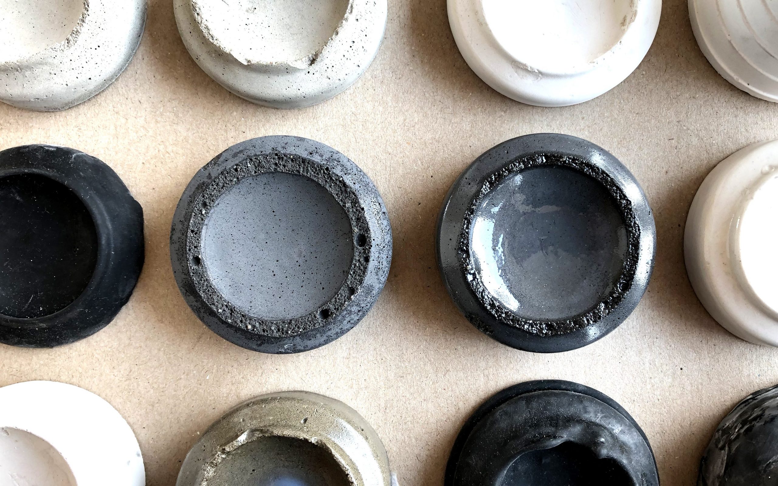
The dark grey casting in the middle to the left is a non-coated shape. It has a matte surface. To the right, the same shape has been given a glossy coating. This means that the light is reflected strongly and thereby changes the perceived colour. The actual colour is dark grey, the perceived colour ranges from almost white to almost black. The conclusion is that the material finish is essential for the perceived colour.
Cold and warm
The Contrast of Cold and Warm occurs when colours relate to other memorised sensations. The highest cold-warm contrast is between blue-green that resembles ice and red-orange that resembles fire.
The Contrast of Cold and Warm is illustrated here by a series of yarn wraps in blue nuances ranging from almost green to almost violet. The yarn wraps thus become a constant form in the experiment. The lighting is also constant. The variables are the colours and the materials, respectively. At first sight, the yarn can also be seen as a constant, as it is not in contrast to other materials such as wood, paper, glass etc.. But since the quality of the yarn fluctuates between wool, silk and cotton with different surface treatments, it nevertheless appears as a variable material. Similarly, the colour changes so that the blue appears in several variations of hue, saturation and value.

Unlike the two previous Systematic Experiments this becomes more complicated to evaluate due to more variables.
Complementary
The Complementary Contrast occurs when two colours are diametrically opposite each other in the colour wheel. When a pair of complementary colours are mixed the result is grey.
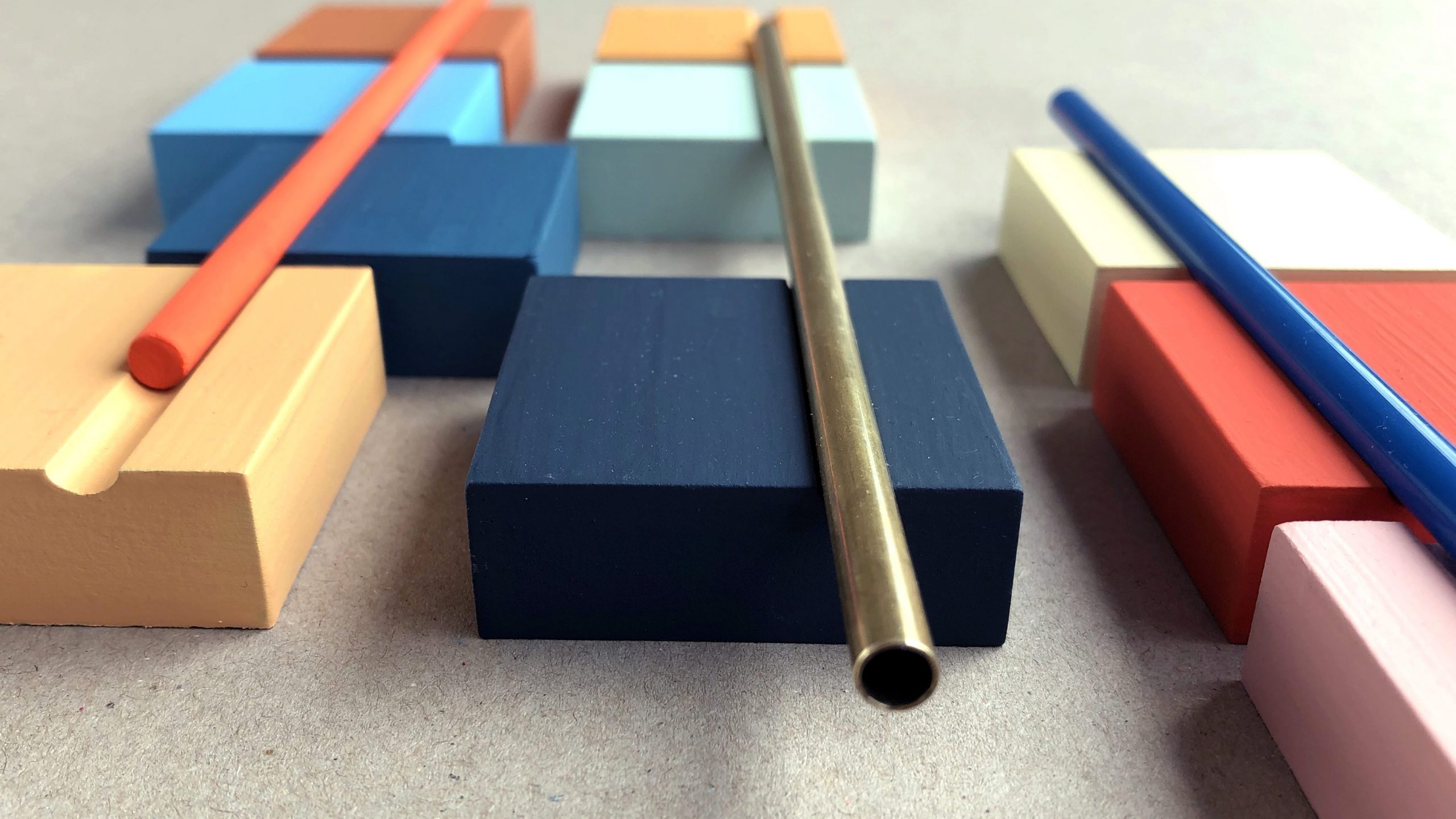
The Complementary Contrast is here illustrated by a series of three-dimensional objects in variations of the complementary colour pair: blue and orange. It is conducted as an Exploratory Experiment initiated by a ‘what if’ question and driven by a curiosity to examine not only the impact of the material on the complementary colour contrast but also to explore the beauty of the contrast. Adding a playful and aesthetic dimension has, to some extent, moved the focus from the examination of the colour contrast in the material to the compositional work of combining forms. This initially makes the experiment hard to evaluate when asking the question: How does the material impact the colour experience and the colour contrast?
Simultaneous
The Simultaneous Contrast is a result of our vision trying to create a strong contrast. The simultaneous effect occurs when two colours affect each other and induce a visual contradiction with each other.
The Simultaneous Contrast is also created here as an Exploratory Experiment. And much like the experiment with the Complementary Contrast an evaluation is difficult when asking the question: How does the material impact the colour experience and the colour contrast? This situation gives rise to other relevant questions within artistic research. If the focus in an Exploratory Experiment can change, then the focus in the evaluation ought to change with it. In this case an evaluating question could be: Is this a dynamic composition?

However, coming back to colour, the experiment still confirms the effect of the simultaneous contrast. The pale, yellow colour becomes bright and saturated against the darker colours, whereas it almost dissolves against the white background.
Saturation
The Contrast of Saturation, also called Contrast of Quality, relates to the degree of purity of a colour. This contrast is found between pure, intense colours and dull, desaturated colours.
The Contrast of Saturation is illustrated here with a number of yellow colours on wood. The colours range from a highly saturated, vivid yellow to dull, desaturated yellow. However, there are also contrasts in both value and hue which affect the experience of the colours.

The experiment is somewhere in between a Systematic and an Exploratory Experiment. By using ‘The Colour and Matter Links’ as an analytical tool we can identify two additional differences. In ‘Finish’ there is both a very glossy and smooth surface in the paint as opposed to a matte surface in the wood. There is also in ‘Uniformity’ a difference between the completely monochromely painted surface and the mottled surface of the wood. A subjective experience shows that a glossy finish and a monochrome uniformity increase the saturation in the perceived colour.
Extension
Contrast of Extension represents the size ratio between two or more colour patches. Itten suggests harmonious proportions based on Goethe’s work on lightness.
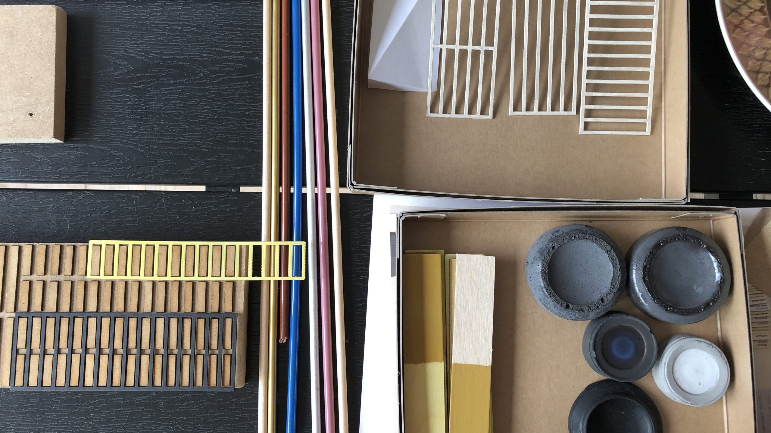
The Contrast of Extension was performed entirely as an exploratory experiment. In the case of the simultaneous contrast and the complementary contrast both experiments were initially Systematic but turned into Exploratory Experiments as they developed. The work with the contrast of extension was from the beginning meant to be an Exploratory Experiment. The idea was intuitively to create material compositions with colour pairs that could vary in value and saturation as well as all ‘Colour and Matter Links’.

A series of compositions were made this way and many things can be said about the combinations of colours and materials: how the contrast in material qualities supports the general contrast in colour and how the light brings out both brightness and shadows. It is difficult in an experiment like this to evaluate the work based entirely on the contrast of extension, since the experiment holds so many variables. But it leaves us with an insight into the seductive properties of colour, for both the creator of the experiment and the observer of the results. The contrast of extension is based on a theory about a certain harmonic composition of colours. It gives rise to unanswered questions about subjective harmony.
Statements on colour
These experiments have all been executed by the writer. The methods have been tested by students at Design School Kolding and similar results have been produced. The experiments and their results have been discussed with both students and lecturers at Design School Kolding. Some of the experiments have been highlighted as systematic and relatively easy to evaluate. However, as we had to carry out the actual evaluation of each experiment by recording the impact of the colour and the material on the contrasts, the complexity became apparent. A discussion arose as to whether it is possible to compare a specific contrast that also varies in other contrast ratios. The conclusion was that in order to assess the influence of the material, the different materials had to appear in the exact same colour, which was often not the case.
There was broad consensus that ‘The Colour and Matter Links’ in the colour samples played a role in relation to the contrast. Based on the many experiments with creating contrast ratios in both colour and material, the booklet presents some statements about how the material affects the appearance of the colour. The statements are based on the writer’s observations and conversations with students. Since no purely systematic studies have been conducted, only qualitative work, the following statements must be regarded as guidelines rather than unambiguous truths. All statements are based on the four “Colour and Matter Links.”
Transparency: When a material has a high degree of transparency, it is affected by the colour and light of the background, which can cause changes in both hue, saturation and value.
Texture: A material with a rough structure may appear with a darker value due to the shadows in the structure. This can also make the colour sample seem less saturated.
Finish: A very glossy material becomes sensitive to the effect of light, which affects the value. A glossy material is experienced by several as contributing to a high saturation.
Uniformity: A material with a grained colour combination is perceived as less saturated.
These observations all point to the fact that the material has a significant impact on our colour perception. For example, a quality contrast can be enhanced by the highly saturated colour having a smooth texture and a glossy finish, while the lowly saturated colour has a matte finish and a grained colour combination. The overall conclusion is that adding form, materiality and light has an enormous impact on the perception of colour and colour contrasts. When the light hits a three-dimensional form, a number of colours will appear in the graduation between light and dark. When the light hits a material, the colours will be reflected differently depending on the material surface.
This booklet is the outcome of an artistic research project conducted by the writer at Design School Kolding in 2019. The intention was partly to examine the relationship between colour and material and partly to propose a method with which design students can experience the effect of material on colour. The work is based on the hypothesis that reading about colour and material will not provide full insight into the matter; the student must experience the colour and material relationships by making experiments. By suggesting not only a systematic approach but also an exploratory approach, the hope is that the student will surrender to the colour and experience it in all its splendour.
– have fun!
References
Albers, J. (2013) Interaction of Color. 50th Anniversary Edition. Yale University Press
Arnkil, H. (2013) Colours in the Visual World. Aalto University Publication.
Becerra, L. (2016) The Fundamental Principles of CMF Design. Colour Material Finish. Amsterdam: Frame Publisher
Goethe, J. W., Von. (1971). Goethe’s Color Theory (1st ed.) (R. Matthaei, Ed.; H. Aach, Trans.). Van Nostrand Reinhold.
Itten, J. (1977) Farvekunstens Elementer. Borgens Forlag
Jongerius, H. (2016) I Don’t Have a Favourite Colour. Berlin: Gestalten Verlag
Mikkelsen, M.K (2018) Colour Combos. Methods in Design Education. In: Colour Culture Science, pp.121-128
Swirnoff, L. (2003) Dimensional Color. New York: W.W. Norton & Co.